Let's get started!

preferred reply

Logo Footer

Office: 205 Durham Street (top floor)
Christchurch CBD 8011
PO Box 3871, Christchurch, NZ

Enquiries: 0800 30 8996
(03) 964 5305 - Reception
[email protected]

Web Support:
(03) 961 1106 - Support
[email protected]

Socials

Facebook X Instagram Vimeo
Activate Design Limited

responsive web design for future business

The late/great Albert Einstein once said “I never think about the future, it comes soon enough.” True enough for some, Al, but when it comes to web design and business, we think it’s smart and necessary to think about the future in order to succeed. As we all know, change happens fast, and in the worlds of web design, business and technology, it happens even faster. To be good web designers and business operators, we need to stay on trend and stay current. To be excellent at what we do, it’s necessary to identify trends before they hit.  mobile web designs

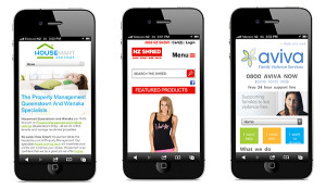
With the advance in mobile technology in the last few years, it’s no surprise that more and more people are using their mobile devices to access the Internet. How is it then that the vast majority of businesses are still not mobile user-friendly? Can I be frank? If you’re a business owner and you don’t have an online presence that is accessible via mobile you’re missing out on major business opportunities. There’s nothing complex about having a mobile presence. The answer is so simple:Responsive Web Design. So, what is it exactly?

Responsive web design is a web design style that crafts websites with the aim of providing an optimal viewing experience. These websites are easy to read and even easier to navigate across a wide range of devices by being coded in a way that uses a minimum of resizing, panning and scrolling, thus making it a very user-friendly style. Happy users are happy customers and happy customers spend more money. This is what we call conversion. So, how do you get the most out of your responsive design?

Ring! Ring!

When it comes to creating a mobile website, you have two options: Responsive Design and Mobile Templates. Responsive design is easier in that it requires only one website that is coded in order to adapt to all screen sizes and therefore accessible through multiple devices. Mobile templates aren’t as friendly. They require an entirely separate mobile-only website. You can see why this is a problem! It’s more work, more money and more hassle.

Consider this:

  • More people are using their mobiles for Google searches
  • 25% of Internet users access it on a mobile device
  • 25% of all emails are opened on mobile phones
  • 61% of people have a better opinion of brands when they offer a good mobile experience

Keeping customers happy is paramount to a successful business so providing a positive user experience should be a top priority. If someone lands on your mobile website and doesn’t find what they’re looking for easily they’re likely to leave your site for your competitor. A positive experience on mobile devices can translate into more profits as the customer is 67% more likely to purchase your services or products if it’s fast and easy to do so.

Keeping Google Happy

It’s a well-known fact that Google prefers responsive web design over mobile templates. Just like your customers, Google wants to be able to navigate your site and organise the content with ease. With responsive design your site has one URL and the same HTML across any device making it easier for users to share and engage with the content compared to sites with different pages for mobile and desktop users. Google knows that unhappy customers will go to other sites which then results in an increase in bounce rates and lower ranking on mobile searches. Beware: Google’s external link algorithm then gets cranky and this can have serious consequences for your SEO.

Back to the Future

One of the best characteristics of responsive design is that the size of the template is designed based on screen size and not specific devices. Technology is in a state of flux at all times. New devices are dreamed up and created faster than you can say “Eight Track Player”. Your responsive website won’t be made obsolete with the advent of new technology. It will stay current and beautiful which saves you money because you won’t need to tweak it. Speaking of money…

Responsive Design: How Much Does It Cost?

Depending on your current website, changing it to a responsive design may cost a few hundred dollars or a few thousand. That’s assuming the existing design lends itself to becoming responsive. If you haven’t redesigned your website in the last several years it’s quite probable that you’ll need to go through a complete redesign process. As designers we know that the cost depends on how much work you want to get done.  If you’re interested in converting your existing site to responsive design, we can help. Just get in touch with one of our designers and they can talk you through the process. If you’re looking to stay competitive in the marketplace, you’re going to have to make the leap to responsive design.

Call me: The Future Is Mobile

Going ‘responsive’ can present challenges for website owners but without a mobile-friendly website the future of your online presence is bleak. If you’re not providing a mobile-friendly experience for your customers, they’ll bounce off your website and go to your competitor whose website is easier to use. Haven’t you ever done that before yourself? I know I have. The future, as we all know, is mobile. People prefer their mobile devices over desktop and laptop computers. Consider this fun fact: by 2017 5 billion people will use mobile phones. Can you afford to stay in the Dark Ages of web design? Nope.

There are, however, some exceptions to the rule:

  1. Your business doesn’t depend on your website to operate. (Lucky you!)
  2. Your business has absolutely no competitors in the marketplace. (Um, really?!)
  3. You’re totally familiar with responsive design, you know that it’s not the right fit for your business and you have an alternative mobile strategy. (Fair enough.)

If any of these 3 points resonate with you, then you have nothing to worry about. If not, get in touch. We’re here and we’re ready to update your website to be responsive. Welcome to the future.


Posted in Responsive Design, Website Design

Flat Design: History, Advantages, Disadvantages.

In early web design, designers wanted to showcase their skills with vivid animations, three-dimensional graphics, and more. Then came skeuomorphic design, a design type which aimed to mimic real life with shadows, textures, and more. 

And most recently, flat design has become the leading technique for web designers. 

What is Flat Web Design?

flat website design style

Flat design is a UI technique that uses two-dimensional elements and bright colours. This means stylistic characters like drop shadows, gradients and textures are removed so that they lose the three-dimensional element. 

Flat design is commonly characterized by clean edges, solid colours, engaging palettes, flat/two-dimensional images and multi-browser compatible icons and fonts. It is meant to be minimalistic; and if a component of the design serves no functional purpose, then it is often discarded.

What are the Advantages of Flat Web Design?

Originally developed for responsive design, flat design enables web content to scale according to the user’s screen size. And with less graphical content, this technique allows the scaling process to occur faster, thus allowing the webpage to load faster. 

By removing older design styles that can quickly phase out of style, modern web designers are essentially future-proofing their designs to align with modern principles and ensure their websites continue to provide a positive user experience. 

What are the Disadvantages of Flat Web Design?

As with any trend, especially in the world of design, there are downfalls of modern trends. For one, it’s trendy. Many designers like to approach websites with their own style that does not conform to trends. 

In terms of stylistic principles, there are a few disadvantages to flat design. The first is colour. The use of bright colours often makes it difficult to match colours. 

Another issue is typography. If a font that is too slim or narrow is chosen, it may be difficult for users to read. 

And though flat design was intended to be minimalistic, many critics argue that it’s too simple. They suggest that it’s impossible to send complicated, sometimes underlying, messages in flat designs. Essentially, they’re implying that flat design limits creativity. 

With a better understanding of what flat design is, the history of it’s evolution may seem clearer. 

Creation Myth: Where Did Flat Design Come From?

Most of what we see on the web has origins from fine art. While it may be difficult to determine the exact start of flat design or where it came from exactly, we can look at a few periods of design and art that flat design takes inspiration from.

Swiss Style of Design

The Swiss style of design, also known as the International Typographic Style, is the main period of design that comes to mind when considering the history of flat design. This minimalist style was dominant throughout the 1940s and 1950s and mainly focused on the use of grids, sans-serif typography, and the clean hierarchy of content and layout.

Typography was a major element in Swiss design and soon our much loved Helvetica typeface was created in Switzerland in 1957. Thank you Switzerland!

Minimalist Design

Flat design has also been influenced by Minimalism. The term “minimalism” is sometimes used interchangeably with today’s flat design, but minimalism was a popular art technique decades before the web was developed. Minimalism has history in architecture, visual art, whereas flat design takes its influence from the design and visual art expressions of minimalism. Minimalism embraces efficiency. When you employ a minimalist aesthetic, you leave just the necessary elements. Geometric shapes, bright colours, and clean lines dominate both old and modern minimalism style design.

Who’s Your Daddy?

Microsoft and Apple have had the most impact on making flat design popular in the last decade. While Microsoft was working on its flat design style, Apple was working on something similar. Apple started hinting at moving away from its use of skeuomorphism, and then completely abandoned it in favour of flat design with the release of iOS 7 in the summer of 2013. The design of iOS 7 seemed to have made the flat design even more popular than it was before practically overnight.

Apple carries a lot of clouts when it comes to trendsetting styles and people tend to follow its design aesthetic because it feels more modern and on trend. So when Apple switched to flat design everything else seemed outdated and people began to redesign with this new, flatter design. This is most evident in the different apps that have been updated to work well with iOS 7.

Ring! Ring! Hello Responsive Design!

It’s important to note that the main reason flat design has become so popular in recent years is because of the development of responsive web design. As more and more devices are connecting to the web, with various screen sizes and browser restrictions, designers are finding that their tried-and-true design styles don’t translate as well when you have to shrink those designs into smaller viewports.

Flat design allows for the efficient web. Without the extra design elements in the way, clutter up space, websites can load much faster and are easier to resize to smartphones and tablets. It’s much easier to display crisp boxes and typography than it is to make several different images to accommodate all the various devices and features out there.

Back to The Future… of Flat Design

Considering how fast the web changes these days, it’s easy to say that flat design will eventually run its course in due time. It’s not the perfect design and there are obvious flaws. But as designers experiment, test, and learn, flat design will evolve and eventually a new style will emerge in its wake. Perhaps it’s just a matter of being able to incorporate it with other styles the way Google does. They take the best of both worlds…hmmm!

While the flat design may seem new and exciting and is a popular trend, it isn’t revolutionising the web. Flat website design creates a dividing line between technology and tactile objects encouraging a user-friendly and functional approach to ‘design’, with an emphasis on ease of operation. It makes surfing the web via your smartphone and tablet easier, but it’s nothing groundbreaking, is it?! Well, its user-centric foundations have seen it replace the old-school skeuomorphic design with a more simplified, universally recognised aesthetic.

Flat design empowers the UI of all modern Apple, Android and Windows devices. To adopt its approaches is to inherit its reach. It’s a style consumers expect and trust these days, and its introduction within the framework of your website could be the difference between online success & failure.

Flat UI designs, using brighter colours and flat visual effects with negligible or even nil gradients and graphical illustration, became popular because of the outrageous demand of something new and minimalistic. They follow a minimalist, responsive approach that is user-friendly, eye-catching, and works on any kind of website that exists.

Lost and Found

Have I lost you yet? This is a lot of information, but I’m going to give you some links to some more. There are plenty of resources out there that can help you better understand flat design and can advise you on how to use it on your own personal and professional projects.

There are literally hundreds of other websites that will offer you all kinds of flat design UI kits. If a flat design isn’t your aesthetic, then don’t adopt it as your design mantra. There are ways for you to stay true to your natural style and incorporate elements of flat design in order to stay up to date and contemporary.

The beauty of the flat design is that it’s clear-cut and clean. The sharpness and varied features result in a design that’s modern and tidy. If it’s too simple it may be unable to put across a complex visual communication. Some experts feel that this simplicity may be a disadvantage, but who can say for sure? At the end of the day, good design is all about usability and functionality. No one design can fit all websites and it’s up to you what kind of style you want to embrace. Right now, flat design is in fashion, so we feel it’s best to stay current and keep up with the trend.


Posted in Website Design, Graphic Design, Responsive Design

Recent articles

Categories