


CASE STUDY - PAWS DAYCARE
Paws Daycare operates a successful dog daycare business. Looking to rebrand from their old, cliché paw-print logo, they asked us to come up with something fun, fresh and unique.
This was to coincide with a new website project we were developing too.

Jon Tarr - Design Commentary
Our client wanted a bright, fun, playful look with the rebrand. A kind of preschool / childcare vibe, but for dogs — and certainly not using any sort of cliché paw-prints.
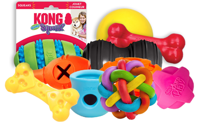
I actually went for a visit to Animates pet story and took inspiration from dog chew toys: Bright, solid colours. Simple, thick-set and robust forms with lots of heavily rounded edges.
My idea was to design a logotype which incorporated these aspects. I wanted the logo to almost feel like a dog toy. i.e. If it was to physically exist it wouldn't look out of place on the shelf in the dog toys section. Maybe even 'squeek' when it was given a squeeze!
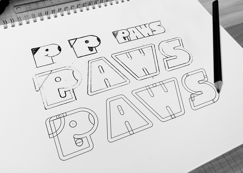
In my sketch phase I discovered I could create something with the letter P. Using the rounded part of of the letter as a big nose, a triangle in the corner like an ear, a smile and a pink tongue — and we have our little dog character, cute, fun and simple!
The remaining letters I designed as thick, solid, rounded shapes. I wanted it to be a single, thick-set piece — as if formed from moulded rubber compound for a dog to chew on.
Symmetry matters: the A and the W share equal angles and the curves of the S reflect the curved nose of the P.
I then merged the letters carefully together as I wanted the logo to be a single piece and not individually separated letters. The A and the W join together perfectly. I let the nose of the P overlap the A slightly, and for balance, the top curve of the S over the W.
I then rounded the corner of each letter so that the newly merged border dips slightly around each letter.
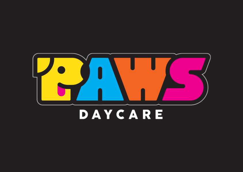
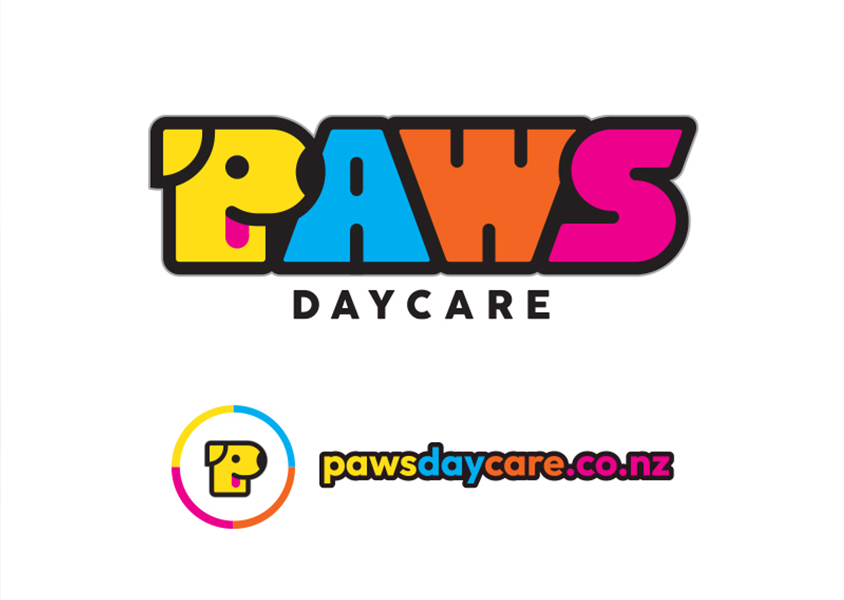
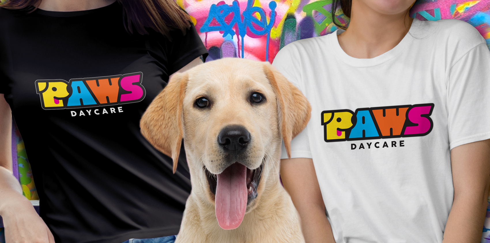
The final result is a logo which is simple, bright, fun and memorable. Encompassing all the playful qualities that we wanted. It is a logo that makes you smile.
Works great against a light or dark background and the little P-dog character makes a great little icon or brandmark by itself.
As a lover of both logos and dogs, I enjoyed working on this one and am please with how it turned out.
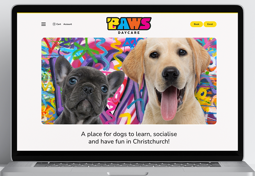
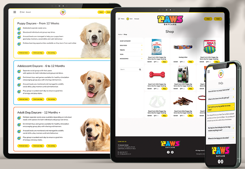
The second part of this project included the design and development of a new custom website for Paws Daycare.
The site was designed to compliment the brand with colourful, rounded tiles, panels and buttons.
Users can learn about Paws, fill out an comprehensive enrolment form and book in their dog for a visit.
The site also includes a e-commerce shop selling dog food, treats, toys and accessories.
You can check them out at: pawsdaycare.co.nz
![]()
"We really like where you’ve taken your inspiration from (the dog toys and colours) and think the P with the dog is just awesome!
Overall we’re really happy with what you’ve sent through!"
Alex Ingrosso - PAWS Daycare