


In the digital age, the success of a website is often measured not only by its functionality and content but also by its visual appeal.
Web design has evolved from simple, text-heavy pages to vibrant and interactive platforms that cater to a wide range of user preferences and expectations. Central to this transformation is the use of colour, which plays a vital role in web design. The field of colour psychology explores how colours can influence human emotions and behaviour.
In this blog, we'll delve into how colour psychology impacts web design and guide you on choosing the right colour schemes for your site.
Understanding Colour Psychology
Colour psychology is a branch of psychology that examines how different colours can affect human thoughts, emotions, and behaviours. It's a fascinating field that has been applied to various aspects of our lives, from marketing and branding to interior design and web design.
In web design, colour psychology is leveraged to create websites that not only look aesthetically pleasing but also serve the intended purpose effectively. Different colours can evoke specific emotional responses, and understanding these responses is crucial for designing websites that resonate with users.
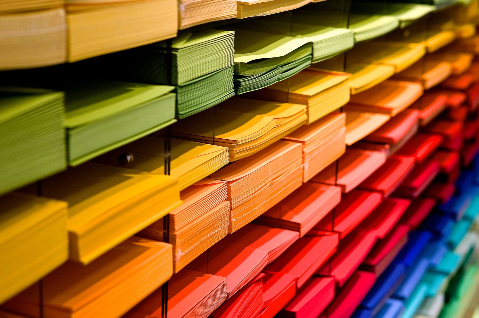
The Impact of Colours on Emotions and Behaviour
Colours have a profound impact on human emotions and behaviour. Here's a breakdown of how various colours can influence users on your website:
Red:
Red is a high-energy colour associated with passion, excitement, and urgency. It can be used to grab users' attention and encourage them to take action. For example, many e-commerce websites use red for their "Buy Now" buttons to prompt quick purchasing decisions.
Blue:
Blue is often associated with trust, reliability, and calmness. It's a popular choice for corporate websites and social media platforms. Lighter shades of blue can create a sense of serenity, while darker blues can convey professionalism and stability.
Green:
Green is often linked to nature, health, and growth. It can be used to convey messages of eco-friendliness, relaxation, and freshness. Many websites in the health and wellness industry use green to create a sense of trust and well-being.
Yellow:
Yellow is a bright and cheerful colour that evokes feelings of positivity and happiness. It can be used to draw attention and stimulate optimism. However, excessive use of yellow can be overwhelming, so it should be used sparingly.
Purple:
Purple is associated with luxury, creativity, and spirituality. It's often used in websites targeting a more artistic or niche audience. Deep purples can convey a sense of opulence, while lighter shades can evoke feelings of creativity and imagination.
Orange:
Orange is a colour of enthusiasm, energy, and warmth. It's an attention-grabbing colour that can be used to encourage action. Orange is often used for call-to-action buttons and elements meant to stand out.
Black and White:
Black is often associated with sophistication and elegance, while white conveys simplicity and purity. These two colors are frequently used together in web design to create a clean and modern look. They are often used in minimalist or high-end fashion websites.
Choosing the Right Colour Schemes
Now that we understand how colours can influence emotions and behaviour, the next step is to choose the right colour schemes for your website. Here are some tips to help you make informed decisions:
Know Your Audience: Understanding your target audience is essential. Different colours may resonate differently with various demographics and cultures. Conduct research or surveys to determine what colours your audience prefers and associates with your industry.
Stay Consistent with Branding: If your website represents a brand, the colour scheme should align with the brand's identity. Consistency in branding helps in building trust and recognition among users. Coca-Cola, for example, is inseparable from its iconic red and white colour scheme.
Consider the Emotional Impact: Think about the emotions you want to evoke in your users. If you want to create a sense of trust, you might consider using shades of blue. If you want to encourage action, red or orange may be more appropriate.
Balance and Contrast: Effective web design often involves using a combination of colours that balance and contrast with each other. This makes your website visually appealing and easy to navigate. Use tools like colour wheels to find complementary colours.
Test and Iterate: Web design is not a one-time process. It's essential to test your colour choices and gather feedback from users. Conduct A/B testing to see which colour schemes perform better in achieving your goals.
Accessibility: Ensure that your chosen colour scheme is accessible to all users, including those with visual impairments. Use colour combinations that provide sufficient contrast and consider alternative text and other accessibility features.
Case Studies: The Power of Colour in Web Design
Let's take a closer look at some websites that effectively leverage colour psychology to enhance user experience and achieve their goals.
1. Airbnb:
Airbnb's website predominantly uses a calming and trust-evoking shade of blue. The colour scheme is consistent with their brand and creates a sense of reliability for users searching for accommodations. The use of green in call-to-action buttons promotes bookings, and the overall design is user-friendly.
2. McDonald's:
McDonald's uses red and yellow, which are known for evoking excitement and enthusiasm. These colours encourage users to feel hungry and act quickly. The colour scheme aligns with the fast-food industry's goal of serving customers promptly.
3. Patagonia:
Patagonia, a company known for its commitment to environmental sustainability, uses earthy greens and blues in its web design. These colours convey a sense of nature and eco-friendliness, aligning with the brand's values and target audience.
4. Apple:
Apple's website design is minimalist and modern, predominantly using black and white. These colours convey sophistication and simplicity, mirroring the brand's identity and high-end products.
Conclusion
Colour psychology is a powerful tool in web design that can significantly influence user emotions and behaviour. By understanding the emotional impact of colours and choosing the right colour schemes, web designers can create websites that effectively communicate the desired message, capture user attention, and encourage actions. Remember that successful web design isn't just about aesthetics; it's about connecting with your audience on an emotional level and guiding them towards your goals. So, when designing or redesigning a website, don't underestimate the role of color in creating a meaningful and impactful user experience.