Let's get started!

preferred reply

Logo Footer

Office: 205 Durham Street (top floor)
Christchurch CBD 8011
PO Box 3871, Christchurch, NZ

Enquiries: 0800 30 8996
(03) 964 5305 - Reception
info@activatedesign.co.nz

Web Support:
(03) 961 1106 - Support
support@activehost.co.nz

Socials

Facebook X Instagram Vimeo
Activate Design Limited

Creating an Impactful Logo Design

Female graphic designer working

A well-designed logo is a powerful tool in establishing a brand's identity and making a lasting impression. By following certain principles and guidelines, designers can create impactful logos that resonate with the audience. In this article, we will explore the dos and don'ts of logo design, including simplicity, originality, versatility, memorability, relevance, typography, and colour choices.

Why is having a strong and impactful logo important?

Logo design plays a crucial role in establishing a strong brand identity. A logo serves as the visual representation of a brand and is often the first point of contact for potential customers. It acts as a symbol that communicates the essence of the brand, evokes emotions, and leaves a lasting impression. A well-designed logo has the power to attract and engage the target audience, differentiate a brand from its competitors, and foster brand recognition and loyalty.

Understanding Your Purpose and Target Audience

Define the Purpose 

Before diving into the design process, it is essential to have a clear understanding of the purpose and goals of the logo. Ask yourself questions like: What message do you want the logo to convey? What values and emotions should it evoke? Is the logo intended to represent a product, service, or the entire brand? Defining the purpose and goals will provide a solid foundation and direction for your logo design.

Identify Your Target Audience 

To create an impactful logo, it is crucial to understand the target audience you are designing for. Research and identify the demographic characteristics, interests, and preferences of your target audience. Consider factors such as age, gender, culture, and industry. Understanding your audience will help you tailor the design elements, colours, and typography to appeal to their tastes and effectively communicate your brand's message.

Research Your Competitors and Industry Trends 

Analysing your competitors' logos and industry trends is an important step in the logo design process. Explore the logos of your competitors and identify common elements, styles, or themes. This research will help you differentiate your logo design and ensure that it stands out in the market. Additionally, keeping up with industry trends will allow you to incorporate relevant elements while still maintaining a unique and timeless design.

By thoroughly understanding the purpose, target audience, and competitive landscape, you lay a strong foundation for creating an impactful logo. In the next section, we will delve into the dos of logo design that will guide you in crafting an effective and memorable logo.

Do’s in Logo Design

1. Simplicity - Keeping the design clean and uncluttered

  • One of the most important dos in logo design is to prioritise simplicity. 
  • A simple and uncluttered design allows for easy recognition and memorability. 
  • Avoid overcrowding your logo with unnecessary elements or intricate details that can confuse or distract viewers. 
  • Opt for clean lines, minimalistic shapes, and a balanced composition.
  • Remember, simplicity enhances the visual impact and ensures that your logo remains timeless and versatile.

2. Originality - Developing a unique and distinctive logo

  • Creating an original logo is essential for brand differentiation and recognition. 
  • Strive to develop a logo that stands out from the competition and captures the essence of your brand. 
  • Avoid using generic symbols or cliché design elements that can dilute your brand's identity.
  • Instead, explore unique concepts, symbols, or visual metaphors that align with your brand's personality and values. 
  • Originality in logo design helps create a memorable and lasting impression on your target audience.

3. Versatility - Ensuring the logo works well across different platforms and sizes

  • An impactful logo should be versatile enough to adapt to various applications and sizes. 
  • Consider the different platforms and mediums where your logo will be displayed, such as websites, social media profiles, business cards, or signage.
  • Ensure that the logo remains recognisable and legible, whether it is scaled down for a mobile app icon or enlarged for a billboard. 
  • A versatile logo design allows for consistent branding and maintains its impact across different contexts.

4. Memorability - Designing a logo that leaves a lasting impression

  • Creating a memorable logo is a key goal for any designer. 
  • A memorable logo leaves a lasting impression in the minds of viewers, helping to reinforce brand recognition and recall. 
  • To achieve this, focus on developing a unique visual concept, utilising distinctive colours, and incorporating creative typography. 
  • Consider using visual elements that are unexpected or evoke emotions to make your logo more memorable. 
  • A well-designed logo that stands out from the crowd will leave a lasting impact on your audience.

5. Relevance - Reflecting the brand's values, products, or services 

  • A successful logo should be relevant to your brand's values, products, or services. 
  • It should visually communicate what your brand represents and resonate with your target audience. 
  • Research your brand's core values, mission, and unique selling points.
  • Use this information to guide your design choices and incorporate elements that align with your brand's identity. 
  • The logo should effectively convey the essence of your brand and create a connection with your audience.

Don’ts in Logo Design

1. Overcomplicating the design with excessive elements 

  • One common mistake in logo design is overcomplicating the design with too many elements. 
  • Avoid the temptation to include unnecessary details, intricate patterns, or excessive text. 
  • A cluttered logo can make it difficult for viewers to understand and remember your brand. 
  • Keep the design clean, focused, and visually balanced. Remember, simplicity is key in creating a memorable and impactful logo.

2. Relying too heavily on trends that may quickly become outdated  

  • While it's important to stay informed about design trends, relying too heavily on them can lead to a logo that quickly becomes outdated. 
  • Design trends come and go, and what's popular today may lose its appeal tomorrow. 
  • Instead of following every trend, aim for a timeless and enduring design that will stand the test of time. 
  • A logo with a classic and timeless aesthetic will maintain its relevance and impact, even as design trends change.

3. Using cliché or generic symbols that lack originality 

  • Avoid using cliché or generic symbols in your logo design. 
  • Overused symbols such as globes, arrows, or generic icons can make your logo appear unoriginal and unremarkable. 
  • Strive for a unique and distinctive visual representation of your brand. 
  • Conduct thorough research to identify symbols or visual metaphors that align specifically with your brand's identity, values, or industry. 
  • An original and thoughtful logo design will help your brand stand out and make a lasting impression.

4. Incorporating too many colours that can confuse or distract viewers 

  • Colour is an important element in logo design, but using too many colours can be overwhelming and confuse viewers. 
  • Aim for a colour palette that is harmonious, balanced, and meaningful to your brand. 
  • Limit the number of colours used in your logo to two or three, ensuring that they work well together and evoke the desired emotions. 
  • Remember that colours have psychological associations, so choose colours that

5. Neglecting scalability and legibility in different sizes and applications 

  • A logo should be versatile enough to maintain its legibility and impact across various sizes and applications. 
  • Neglecting scalability can result in a logo that becomes distorted or illegible when scaled down or reproduced in different mediums. 
  • Ensure that your logo remains clear and readable, even when it's reduced to a small size for a website favicon or printed on a small promotional item. 
  • Test your logo in different sizes and applications to ensure its visual integrity and effectiveness.

Typography and Colour Choices

Select fonts that align with the brand's personality 

Typography plays a significant role in logo design as it conveys the brand's personality and sets the tone for the visual representation. 

When selecting fonts, consider the brand's values, industry, and target audience. Fonts can be categorised as serif, sans-serif, script, or display, each with its own characteristics. 

Serif fonts - often convey a sense of tradition and reliability, while sans-serif fonts give a modern and clean look. 

Script fonts - add elegance and playfulness, while display fonts are bold and attention-grabbing. 

Choose fonts that align with your brand's personality and create a harmonious visual impact.

Understanding the psychology of colors and their impact on perception

Colours have a profound effect on human psychology and perception. Different colours evoke various emotions and can influence how your brand is perceived. 

For Example: 

Blue - is associated with trust, stability, and professionalism, making it suitable for financial institutions. 

Yellow - conveys energy, optimism, and creativity, making it ideal for brands in the entertainment or food industries. 

Green - symbolises nature, health, and sustainability, making it relevant for environmentally conscious brands. 

Research colour psychology and choose a colour palette that reflects your brand's values, resonates with your target audience, and aligns with the message you want to convey.

Harmonise typography and colours to create a cohesive design 

To create a cohesive and visually pleasing logo, it's crucial to harmonise the typography and colours. Ensure that the chosen font styles and weights complement each other and work well together. Consistency in typography helps establish visual hierarchy and enhances readability. 

Similarly, the colour palette should be harmonious, with colours that complement and enhance each other. Consider the contrast between the font colour and the background colour to ensure legibility. Pay attention to the balance between text and graphical elements, ensuring that they work together seamlessly to create a unified and cohesive logo design.

Test and Refine Your Logo

Gather feedback - Share the logo with stakeholders, clients, or your target audience and encourage open and honest feedback. Their perspectives can provide valuable insights and help you understand how your logo is perceived and whether it effectively communicates your brand's identity. 

Refine the logo based on feedback - Analyse feedback looking for recurring patterns or suggestions that align with your brand's goals and objectives. Experiment with different iterations, incorporating the feedback and making adjustments to the design elements, typography, colours, or overall composition. 

Consider long-term scalability and adaptability - A logo should be designed to withstand the test of time and remain relevant as your brand grows and evolves. Consider how the logo will look in different sizes, from a small social media profile picture to a large billboard. Ensure that the logo remains legible and visually appealing across various mediums and platforms. 

Designing an impactful logo requires a balance of creativity and strategy. By prioritising simplicity, originality, versatility, memorability, and relevance, designers can create logos that effectively represent the brand and leave a lasting impression. Additionally, careful consideration of typography and colour choices helps create a cohesive design. Through testing, gathering feedback, and refining, designers can continuously improve their logo designs. With a well-crafted logo, brands can establish a strong identity and connect with their target audience.

Leave your logo design with us, get in contact today!

Posted in Branding, Logo Design, Marketing

Why You Should Still Have Business Cards

Business man in suit handing out a business card

In a world driven by digital communication, the role of business cards may seem diminished. However, professionals continue to recognise the value of business cards as a tangible representation of their brand and expertise. This blog post will explore why you should have a business card and how to design it effectively. From making a lasting impression to enhancing credibility and facilitating seamless information exchange. Business cards play a vital role in establishing a professional identity in today's competitive landscape.

Do professionals still use business cards?

Business cards may seem outdated. However, professionals continue to use business cards despite advancements in digital communication. Business cards serve as tangible representation of professional identity and are still widely used in various industries and networking settings.

The importance of establishing a professional identity

In today’s fast-paced and competitive world, establishing a solid professional image is crucial for success, as people are naturally drawn to individuals who project professionalism. 

Your professional image encompasses various factors, including appearance, behaviour, and communication skills. Employers, clients, and business partners are more likely to trust and engage with individuals who have a professional image. 

A professional image enhances your chances of securing job opportunities or business deals and fosters long-lasting relationships built on trust and respect.

Why you need business cards

Tangible Representation -  Business cards serve as a tangible representation of your brand and expertise. It allows you to showcase your unique identity and communicate key information about yourself or your business in a concise and visually appealing manner.

Networking Tool - Networking events and professional meetings often involve exchanging contact information with numerous individuals. Amidst the sea of digital connections, a well-designed business card stands out and makes a lasting impression as a physical reminder of your encounter. 

Enhances Credibility and Professionalism - A professionally designed business card signals that you take your work seriously and pay attention to details. Presenting a well-crafted business card instils confidence in the recipient, showcasing your commitment to professionalism and excellence. 

Exchange Details Seamlessly - Business cards provide a hassle-free and reliable way to share your information. Handing over your business card ensures that your contact details are easily accessible, allowing for a smooth and efficient follow-up process.

Digital is not enough - While digital platforms offer convenience in exchanging contact information, they can be impersonal and prone to technological glitches. Business cards eliminate the need for typing or searching through contact lists, allowing for a seamless exchange of information in face-to-face interactions. 

How to design professional business cards

Your business cards should…

Reflect your brand identity and values

  1. Choose a colour scheme that represents your brand to evoke the desired emotions.
  2. Use fonts that are legible and align with your brand’s personality.
  3. Strategically place your logo for maximum visibility.

Ensure readability and clarity

  1. Choose fonts that are easy to read, even at smaller sizes ensuring text is not too small or too crowded.
  2. Arrange the information on your card in a logical and easily scannable way. 
  3. Use hierarchy to emphasise essential details, such as your name and job title.

Include essential information

  1. Display your name and position and/or job offering 
  2. Include your phone number, email address, and physical address if relevant.
  3. Include your website URL and social media handles to encourage online engagement if applicable.

Use high-quality materials

  1. Use thick cardstock to give your card a premium feel and durability. 
  2. Consider finishes like matte, gloss, or textured coatings to enhance visual appeal.
  3. Consider using special finishes like foil stamping, embossing, or spot UV to add a touch of uniqueness and make your card visually distinctive.

All business cards should be optimised for the business card dimensions 90mm x 55mm

Layout and Composition

The layout and composition of your business card play a more important role than you may realise in creating a visually appealing and effective design.

How do I layout and compose my business cards?

Balance visual elements and incorporate graphics

Placement - strategically position your text and logo to create visual hierarchy. The most important information, such as name and job title, should be prominent.

Utilise white space - leave sufficient white space (empty space) around each element to improve readability and create a clean and elegant design. White space also helps guide the viewer's eye and highlights important information.

Experiment - create multiple options with different arrangements until you achieve the one that is most visually appealing.

Graphics - use relevant icons, images, or patterns to enhance visual interest. Icons can be used to represent contact information (e.g., phone, email) or social media handles.

Maintain clean design - keep the design clean and uncluttered, allowing each element to breathe. This ensures that your information is easily readable and creates a professional impression.

Should my business cards include a logo?

Yes, including a logo on your business cards is highly recommended. A logo is a visual representation of your brand and serves as a powerful tool that can strengthen your brand identity, enhance professionalism, and help you make a memorable impression. When designing your business card, consider the size and placement of your logo to ensure it is prominently displayed and easily recognisable. Ensure your logo is in high resolution and properly scaled to maintain quality when printed on the business card.

Printing and Production

Once the card design is finalised, it is time to get quality prints of your business cards.

What should I consider when getting my business cards printed?

Select a reputable printing service and double check the information

Research - Researching print quality, options, and pricing: Look for printing services that offer high-quality printing options suitable for your desired card design. Consider factors such as paper stock options, finishes, and printing techniques.

Request samples - request print samples and proofs before committing to a printing service so that you can evaluate the quality of their work. Additionally, ask for a proof of your business card design to ensure it appears as expected before proceeding with the full print run. 

Proofread for typos and errors - carefully review your business card design, paying close attention to contact details, job titles, names, and any other textual information. Look for spelling errors, incorrect phone numbers, or outdated information.

Double-check the design - ensure the design aligns with the printing requirements of your chosen print provider. There may be specific guidelines for file formats, bleed areas, and colour modes, so ensure your design meets these requirements to avoid any issues during printing. Convert your design to the appropriate colour mode (such as CMYK) and include necessary bleed areas.

Here is what to avoid on your business cards

  1. Cluttered design - Avoid overcrowding your business card with excessive text, graphics, or images. A cluttered design can make it difficult for recipients to read and process the information. Maintain a clean, organised layout that allows the key elements to stand out.
  2. Illegible fonts - Choose fonts that are clear, legible, and appropriate for your industry. Avoid using overly decorative or complex fonts that can hinder readability. Ensure that the font size is large enough to be easily read, especially for contact information.
  3. Poor colour choices - Be mindful of your colour choices and avoid using too many colours that clash or distract from the overall design. Stick to a limited colour palette that aligns with your brand and maintains visual harmony.
  4. Inconsistent branding - Your business card should be consistent with your overall branding, including your logo, colour scheme, and typography. Inconsistencies can confuse recipients and dilute your brand identity. Ensure that your business card aligns with your other marketing materials.
  5. Outdated or incorrect information - Double-check all the information on your business card to ensure its accuracy. Outdated or inaccurate information can lead to confusion and missed opportunities. Keep your contact details, job title, and other relevant information up to date.
  6. Low-quality printing and materials - Opt for high-quality printing and materials for your business cards. Avoid using cheap or flimsy cardstock that can make a negative impression. Poor printing quality can also result in blurred text or images. Invest in professional printing services to ensure a polished final product.
  7. Irrelevant or excessive information - Include only essential information on your business card. Avoid including irrelevant details that can clutter the design. Stick to your name, job title, company name, phone number, email address, and website. Optionally, include social media handles or a QR code to access online profiles easily.

How can I utilise my business cards to their fullest potential?

Beyond the design and printing of your business card, there are additional strategies you can employ to maximise its impact and leverage it effectively in various professional settings. Consider the following tips:

Engage in networking interactions

  1. You are proud of your business cards, right? Well, so are others. When someone hands you their business card, take the time to engage in a meaningful conversation and show genuine interest in their work or business.
  2. After receiving a business card, make it a point to follow up with a personalised message or email.
  3. When following up, reference your conversation or any points discussed to demonstrate that you value the connection.

Use them strategically in networking or professional settings

  1. Carry a stack of business cards to networking events and exchange them when you meet potential collaborators, clients, or employers. 
  2. Ensure your business cards are easily accessible and present them professionally.
  3. Use the opportunity to establish connections and follow up afterward.

Keep them up-to-date

  1. Ensure your business cards are easily accessible and present them professionally.
  2. Outdated information can create confusion and undermine your professionalism.
  3. Keep track of the number of business cards you have on hand and replenish them as needed. Running out of cards can be inconvenient and leave a negative impression.

So, are business cards worth it?

Business cards continue to be an essential tool for professionals. They serve as tangible representations of your brand, make a lasting impression, enhance credibility, and facilitate seamless information exchange. When designing your business cards, remember to reflect your brand identity, ensure readability, include essential information, and use high-quality materials. Additionally, use your business cards whilst networking and in professional settings making sure to keep them up to date. By following these tips, you can maximise the impact of your business cards and elevate your professional image in today's competitive world.

Need a graphic designer to create professional business cards for your business? Get in touch today!

Posted in Branding, Graphic Design, Logo Design, Marketing, Printing

7 design tips when creating a logo

brand words held by faceless character


Thinking of what unites big brands like Apple, Windows, Android, Nike, or McDonald’s? It’s that you’ll be able to recognise any of these brands, wherever you are in the world, because of their iconic logos. They’re the modern success stories of how a company can use their logo to do the following: make a strong impression on customers, communicate distinctive brand identity, and demonstrate what the company’s vision is with just one visual idea. 

A well-designed company logo is a functional investment. It will attract customers to your business, help them distinguish you among your competitors, and uplift your reputation within your chosen industry. You’ll want to partner with someone who provides high-quality graphic design and print services in order to realise these goals.

The following design tips may also help when you’re in the brainstorming phase with your creative team.

1. Study the logos of your competitors or other companies in your industry. If you want a better idea of how a similar business uses their logo, do some research on either your competitors or companies related to your industry. Not only will this give you a better idea of what visuals you want for your own logo, but you’ll also be able to tell whether certain colours, graphic elements, or catchphrases are overused.

2. Be simple and clean in your design approach. Yes, your company logo should be pleasing to the eye, but that doesn’t mean you should cram as many visual elements into it as possible. Most great logos make use of clean lines, simple shapes, negative space, and symmetry.

3. If you want your brand identity to be memorable, aim for something clever. There are several ways to get a customer to remember your brand, and one of them is treating them to a clever inside joke in your logo. One example is the curved bite mark in the Apple logo—without so many words, people understand it to be a pun on computer “bytes.” If you and your creative team can come up with something similar for your logo, all the better it will be!

4. Incorporate something that has to do with the nature of your business. This will serve as a visual cue for your target customers as to what service your business offers. For example, the logo can include a graphic of a spark plug if you offer electrical repairs or the silhouette of a bridal veil if your company organises wedding events. 

5. Integrate your brand colours. Colour gives life and texture to any visual work, but to a company logo, it’s essential in communicating what your brand is all about. There’s already a shorthand as to what people associate with colours. For instance, green evokes nature and is therefore suited to health and environmental brands. Alternatively, gold and silver evoke power and exclusivity and are therefore good for luxury brand logos. Do explore different hues for the colours you’ll use in your logo, and make sure that the finished product looks good in greyscale for use in black-and-white documents.

6. Be particular about your choice of typography. Don’t neglect the textual element of your logo, either. The font you use for your brand name, as well as a catchphrase, should be readable. It should also seem like the natural choice given the logo’s other visual elements: for a premium business-related brand, the font should look crisp and professional, while a brand that has to do with selling artisan products can afford to use similarly artsy custom-type text in their logo.

7. Be open to something other than your initial idea. Lastly, do remember that it may take time to arrive at the perfect logo. You might be set on your first idea, but the first draft might not be bold, communicative, or original enough. Ask your graphic artist to help you come up with at least three studies before you pick one out. You’ll be surprised at how creative you can all be once your initial ideas on the logo are challenged!


Out of the many bland, overly complicated, or confusing logos out there, yours should be able to stand out. May you and your design partner come to a creative, original understanding of what your brand is trying to do—because, in the end, that’s what will elevate a company logo from amateur to amazing.


Posted in Logo Design

When to add Limited or LTD to a logo?

bad logo ltd example

The short answer is.. NEVER. 

Why do some businesses have LTD or LIMITED as part of their logos, mainly the construction and trades industry?

As a logo designer, it is often unfortunate to be asked to retrofit this into a design - it always looks tacked on like an afterthought. Though common in the construction & trades industry, it is an unnecessary addition to a well-designed logo.

Business owners typically provide one of three reasons for wanting to add the legal destination on their logo:

  1. "I want people to know that we're a real company."
  2. "Our lawyer said we have to."
  3. "Everyone else does it."

Unfortunately, none of these are true. Let’s take a look at each of them individually. 

1.  "I want people to know that we're a real company."

LTD is an abbreviation of Limited, stating that the business is a Limited Liability Company.

There are 3 types of companies in New Zealand:

  • Limited Liability Companies - The owners/shareholders of limited liability companies are personally limited in their exposure to the company's financial obligations. This is by far the most common form of company and is designated by Limited, Ltd or Tapui (Limited) at the end of the business name (only necessary on financial & legal paperwork).
  • Co-Operative - Also known as co-ops, these companies exist to provide goods or services to their members & shareholders. They are also limited liability companies and some examples include taxi businesses, dairy companies, Māori community services etc.
  • Unlimited - Unlimited liability companies are rare - their shareholders personally have ultimate liability to all financial obligations of the company. This form exists to meet particular, usually foreign legal requirements. 

So in a sense, yes, displaying LTD or Limited does show that you are a 'real company.'

But are you legally obligated to include it on your logo? On your vehicle? On your building sign? The vast majority of businesses in NZ are limited, but you do not see the LTD present on every logo. Even within the construction industry itself; Hawkins, Fletcher, Naylor Love - none of them have LTD or Limited on their logos, but are in fact limited liability companies.

So why do the smaller players feel obliged to display this legal information so prominently? 

2.  "Our lawyer said we have to." 

From a legal perspective, you should have your full company name included on all financial and legal documentation such as invoices, contracts, tax returns and legal records. This is usually written above contact details, address and so on. However this is irrespective of the logo.

Historically, small start-up businesses would incorporate a company name - and then simply write it out in full. They wouldn't have a logo design - logos were just for big boys like Ford and Coca-Cola. Therefore, their full company name was included.

'Taylor & Sons LTD' written the same on everything from their shop sign to their invoices.

old logo sign with LTD

Now, lawyers are not particularly renowned when it comes to creative logos, branding and identities. Most of them continue the tradition of simply writing out their full company name. As an industry, lawyers, accountants and doctors have been a bit slow to come around to branding and identifying themselves creatively. So it comes as no surprise that advice from a lawyer in regards to a company logo is that it should be the full company name. 

lawyer firm logo sign

Yet you only need to look around at what some of the big players are doing. You won't see LTD, LLC, INC, PTY or any other legal descriptor abbreviation tacked alongside the Apple, Google or Twitter logos... in fact, they don't even use words at all anymore!

brandmark examples
3.  "Everyone else does it." 

Oftentimes, you don’t have to look very far to see a trades or building company with LTD or Limited on their logos and on their utes. Whilst most other industries have long since moved on from this, you are unlikely to see LTD added to logos for florists, beauty clinics, clothing stores, cafes, restaurants or IT firms. 


For the trades and construction industry - the idea really only continues to exist due to the 2 points we have covered. In addition, a small start-up building company will see another small start-up building company and simply follow suit. As their business expands and professional marketing and design teams become involved - their logo is soon separated from the full company name and these legal descriptor abbreviations are quickly dropped.

construction logo examples

Summary. 

If you're starting out in business and incorporating a company. Yes, you should have your full company name on all official legal & financial documents. Your full company name will include the legal descriptor so that your position on liability is disclosed. Seeing this on an invoice does show that you are a real company. However, your logo has nothing to do with any of this.

Take a look at any of the big national brands, none of them will include LTD in their logos. A Logo is a graphic to represent your company - it is not your legal company name. Your logo is a separate entity which can use your shortened name, your trading-as name, or maybe just a symbol - no name at all!

Posted in Branding, Logo Design

The Importance of Professional Logo Design

Why is Professional Logo Design Important?

A logo is essential to any business, big or small, which serves as the foundation to branding and as a symbol that customers associate with the company.

A logo is critical for brand-recognition. Think Coca-Cola. Everyone knows that particular colour red and that swirly script that is associated with one of the most well-branded soft drinks on the market.

CocaCola Logo Design
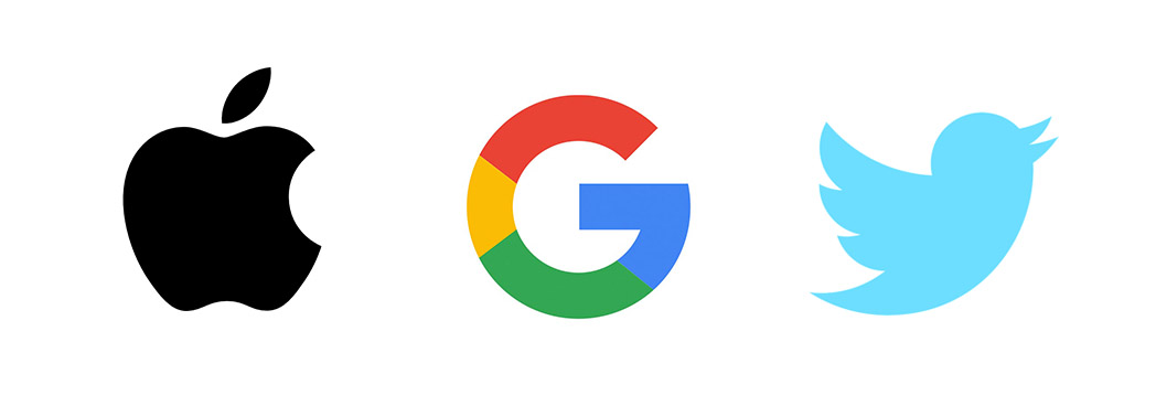
Having a strong logo and brand like this one means that we don't have to think on a conscious level, "what does this represent?", we can automatically recognise this brand at a glance.

This is the kind of brand recognition that is possible when you have a strong logo and bespoke branding strategy. People will come to recognise your brand at a glance, and the more they see it, the more you will be remembered as the "go to" company for your particular product or service.


The Infamous $100,000 logo design

NEXT Logo Design
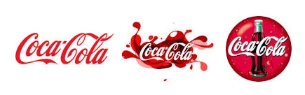
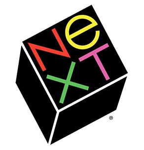
Many design companies will offer you a fixed price and one option for your logo. We do not. An infamous example of the 'fixed price one option logo design' is the NeXT Logo designed by Paul Rand at a cost to Steve Jobs of $100,000.

Steve Jobs has this memorable comment regarding working with Paul Rand; “I asked him if he would come up with a few options, and he said, ‘No, I will solve your problem for you and you will pay me. You don’t have to use the solution. If you want options go talk to other people.’”

Now, not every logo designer is the next Paul Rand; and it’s unlikely that your business is like NeXT.  At Activate Design, we feel that it’s best to work through various ideas & designs directly with you, ultimately creating a logo that is best for your business.


What should a logo mean to me?

A logo is something that you should be proud to include on building and car signage, on company clothing and stationery. It must be unique to your brand and recognisable by your customers, and a signature of your products and services.

Activate logo design examples

Shaggy Bones Bakery logo: representing a bakery specialising in all natural dog treats.

Advanced Applicators logo: representing a service driven company established to distribute and install a range of Passive Fire Protection products.

For more examples of our logo designs, visit our Portfolio Page.

A logo is something that precedes you in business. In this way, your company logo will either be lifting your potential customers' expectations of you or it may be working against you, projecting a negative image. The latter can often occur if your logo resembles a competitor, does not relate well to your company or if the fonts or style is outdated.

Is changing your logo a good idea?

If you have a strong logo then yes, you could use it indefinitely. BUT, it’s worth noting that many well-recognised companies have continued to evolve their logo with time. Companies such as Microsoft and Coca-Cola, Shell, McDonalds and Apple have refreshed and reimagined their brand to keep up with modern styles and ideas.

We offer re-branding services as well, to give your logo new life. Re-branding can be very effective, and you can choose to debut a completely new design or maintain aspects of your previous logo; perhaps a shape or colour that served as the focal point of the design. Ask us about design and brand refresh, to give your brand a makeover with a splash of modern creativity and professionalism.

Apple Logo Design evolutionLogo left: Apple logo 1976 Middle: Apple's logo 1976-1998 Logo right: Apple's current logo.


How is creating a logo design with Activate Design different?


At Activate Design, logos are our passion, and we would prefer to work with you to create a logo that exceeds your expectations. We do this by listening to you, by offering you choices and by listening to your feedback.

We do not outsource your design work.  Our experienced designers will meet with you to discuss your needs. We then research your market to create a unique concept that will make you stand out from the crowd. The research is important to us because you need to be different.

For example, if we were to design a logo for your new soft drink company, it would be prudent to avoid a certain shade of red, and any similar swirly fonts that may relate to existing well-known brands. Business logo design is not just about creating something visually pleasing, it's about doing the research to back it up. About providing a design solution that meets the ongoing marketing needs of your company and being able to provide the reasons why it will work not and for the long term.

If you’re looking for a  logo design company, contact us today to discuss a new logo, logo refresh, or full branding strategy for your business today.


Posted in Graphic Design, Logo Design, Branding

Recent articles

Categories